We have to wait a little while longer to find out what Seattle’s NHL team name will be. But it gets closer and closer, and it seems we know what the finalists are.
Expansion teams are not a frequent thing in professional sports. The NHL has had more than other leagues in recent years. I think it’s so cool when new uniforms and logos are introduced to a league. The Golden Knights were just okay, in my opinion. The logo is unique, but I don’t love the color choices. I would have liked to see a logo with more movement in it, perhaps featuring other “knightly” elements, like a lance or sword. The front-facing helmet just seems too…..static.
Now the league has another opportunity to unveil a name and logo that are unique, striking, and iconic. I really hope they nail it.
It seems that “Sockeyes” is the most popular choice among Seattle fans, according to this article.
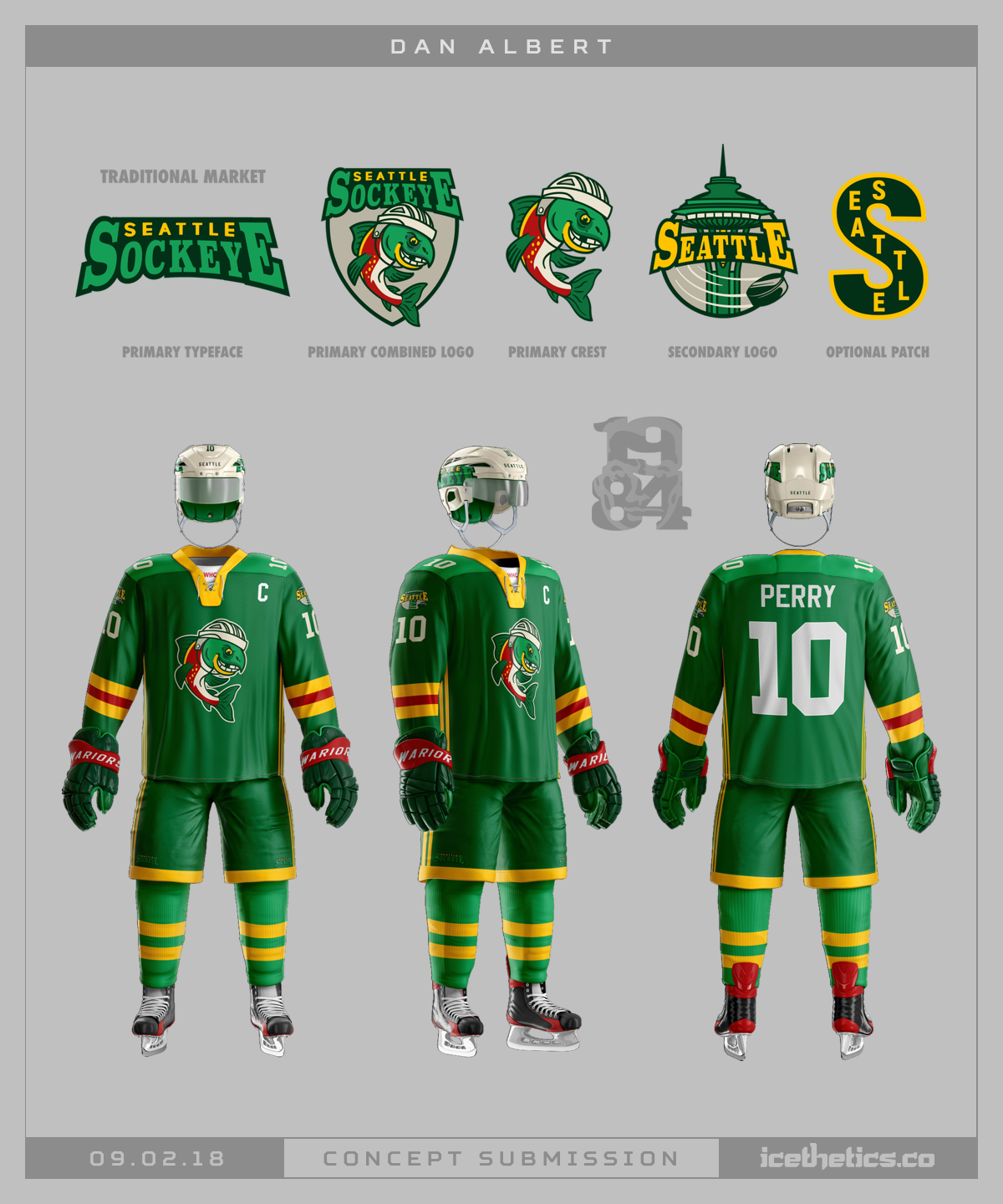
The Icethetics blog has this concept. I really like the green and yellow, with red accent, but the logo is a bit “cartoony.” The colors don’t seem very “Seattle” or “fishy” to me. They can do a lot better than this.

Now this is more like it. I love how the logo is VERY accurate to what sockeye salmon actually looks like. The color scheme is unique – there’s nothing like it in the league, let alone any of the major sports that I can think of. But I don’t know if that’s a logo that a lot of fans would get behind. The sockeye isn’t the prettiest of fish in the sea.
Sockeyes is an ok name. It’s unique, and the alliteration is catchy. But a sockeye isn’t imposing. What is imposing is a Kraken.
Now I LOVE this concept. The Kraken is the best name out of the five finalists, in my opinion. It just makes so much sense. The Kraken is a fearful creature of legend, and fits wonderfully in Seattle’s ocean-side location. The primary logo of the tentacles around the Space Needle is inspired. It just delivers an awesomely cool image of a huge sea monster engulfing the city. I mean, this logo is KILLER.
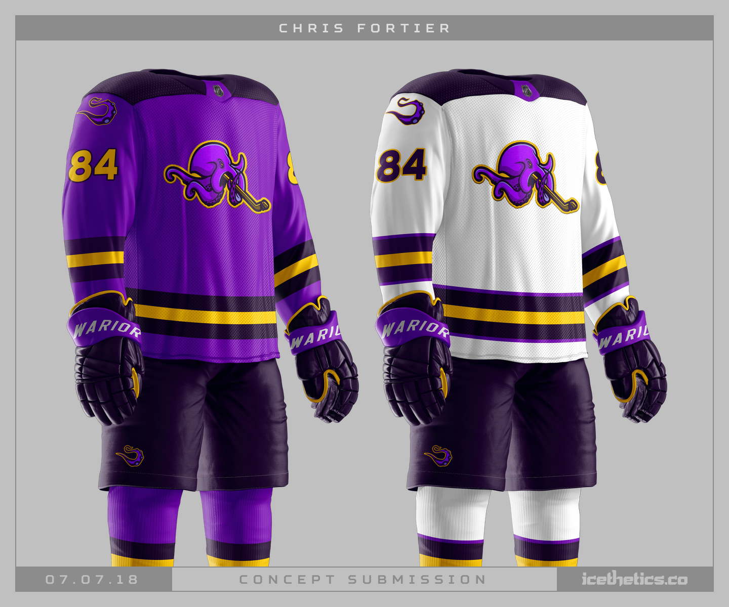
This one, also from Icethetics blog, is a strong one too. The purple and gold really stands out, and that octopus/kraken figure is fun. It has plenty of movement, and the gold outline around the kraken is a nice touch. I just love the tentacle on the shoulders, too.
Kraken is the obvious choice. It’s stronger than Sockeyes or Totems or Metropolitans or Steelheads. Totems might be a non-starter in today’s environment relative to cultural symbols. Metropolitans is boring (there’s already a pro sports team with this name, anyway). Steelheads makes you Google what exactly a Stealhead is (it’s a trout). Kraken is a no-brainer.
We’ll hopefully find out tomorrow, if reports are accurate.

